Monday, 4 December 2017

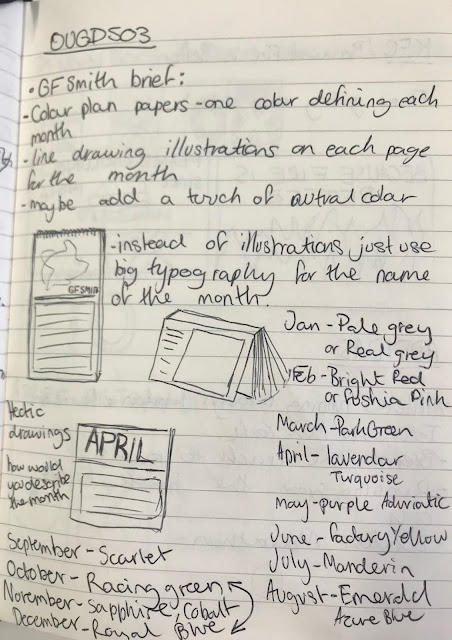
GF SMITH CALENDAR BRIEF


The paper need to be the key part of the design, nothing should take away from the paper and colour. I need to work out how to get people to interact with paper. 

- currently thinking i could leave a place for people to doodle/ make their own graphics for  the calendar

- I think laser cutting the typography would work well and add layers to the paper. 

- I could use cutting techniques to get people to interact with the calendar, having a cut out model they could put together each month might be interesting and would work well with the thick paper.

-another way i could get people to interact with the paper is with drawing maybe have a paint by numbers style illustration to be completed each month.  

- I could use paper folding techniques to create paper sculptures that people could pull out and make themselves. This paper website has many tutorials on different paper folding techniques.

some calendar inspiration for the typography. I would like a simple square left for the paper folding and then a big bold statement of the month.


I tried out some paper folding methods myself by watching online videos and tutorials. all of these models use a single sheet of the same size square paper to make.

https://www.youtube.com/watch?v=kcr3b3UT8kU

https://www.youtube.com/watch?v=nw5RLvN7fYA

PEER REVIEW

I showed my work in the peer review and i got the feedback that the layout works really well, the placing of the square so it can be torn out works. The dates and the name of the month works but i need to explore the typography a bit more. The description for the paper folding is very small and tightly packed in, my reviewer gave me the idea to put the paper folding tutorial on the back of the paper so there is more room and illustrations can be added. 

I needed to test my instructions for the paper folding techniques, so i gave people a page of the calendar to try and make. everyone i gave it to really struggled as the instructions were not specific enough. There needs to be more details on valley or mountain folds in order for the folds to be the correct way. I think just following worded instructions are extremely difficult so i need to create illustrations to follow the words. 


Monday, 20 November 2017

MODULE EVALUATION

End of module evaluation


In this module I really enjoyed the practical aspect, I found binding the book really fun as I feel like hands on stuff is where my talents lie. It was a vast improvement to other books I have made in the past as I used more ambitious techniques such as the hardback cover. I also really enjoyed swapping work with someone and doing someone else project. it gave me clarity that I couldn't get with my own work. I find it hard to look at my own work for so long and swapping and working from a clients demands gave me fresh ideas and a new perspective on my work. I always really enjoy working with people so it was nice to have a dialogue going on between me and my partner it made my work better as I could get feedback from my partner when i needed it. 

In this project I have not enjoyed layout, I found it really hard to fit the typography in my book into the layout, i played around with different variations but i still think the finished look is not right for the full bleed images, although I really like the full bleed images I found it difficult to incorporate any other information around them. I also found it difficult to put the idea of my app into a physical response as I think my skills and style of working held me back. I am not very good at vectors and I feel my imagery was very simple  

From this project I have learnt a great deal of technical skills by using the software, I have enriched my knowledge of indesign as this is the biggest project i have ever done on the software with 52 pages, I had to pay close attention to pagination and layout. I used adobe XD for the first time in this project, i found it relatively easy to pick up with the help from online trials and it has been a very handy tool in showing the navigation of my app. 

Next time I will improve my time management as I spent a long time on studio brief 1 and then didn't have enough time to properly get into studio brief 2, this meant my app was quite rushed. I need to manage my time and set weekly aims in order to get all of the work done on time. Also next time I will make sure I test all of my ideas out before the final product as then there will be no mistakes on the final product. My book went wrong as when I was using the laser guillotine i cut off too much and left some of the writing cropped in my book. If I had tested this before this wouldn't have happened. 


FINAL APP NAVIGATION


Sunday, 19 November 2017

VECTOR IMAGES

Using adobe illustrator i created a vector using the image trace tool as a visual representation of where each place was in the country. 


EVALUATION STUDIO BRIEF 1

I enjoyed making the book as the practical side is something I think I am good at, getting away from the computer and using my hands was a nice change. I enjoyed working with a client and not just using my own work. 

I didn't enjoy layout if my book i find the pagination really hard to get my head around. it wasn't until i had printed the book out that i realised many of the mistakes that i had made. this can be quite a costly mistake. Unluckily for me my book was quite big with many pages so i had to spend a great deal on printing.

Next time i would do many more tests before the final product to ensure nothing goes wrong for the final product. I would also like to develop the front cover a bit more and maybe incorporate some different techniques including foiling or embossing. 

BOOKBINDING PRACTICE


For my book i want to bind using saddle stitch and a hardback cover. this test will help me figure out how the book needs to be put together for the final picece. 


FINAL DESIGN

i am dissapointed with my final design because dispite the test i did i still seem to have come across more floors in the designs. when sticking the book together i got ripples in the paper


The images look better full bleed it helps the book flow better.

TESTING


 i diddnt leave any creep so the end pages have been cut off and cropped badly, for the final thing creep will need to be left. 

I came across a design floor in my idea as it is very hard to line up the pages accurately, so when i bound the book the typography was out of place, to solve this i have moved the typography to the other edge. 

the printer broke when printing out my images so i hope when i do my final print run it is fixed so i dont have streaky images. 


 I struggled to get a clean cut on the pages when i cut it by hand so when i do my final piece i may try to use the laser guillotine.


I dont think the images look right not full bleed, i need to keep in theme with the rest of the book and make the single page images full bleed. 


DEVELOPMENTS


I tried out a veriety of colour combinations to see what would fit my app, i ended up choosing pale pink, and a darker pink paired with a contrasting electric blue. 

EVALUATION STUDIO BRIEF 2

I have learnt that more time needs to be spent developing the idea before it can be fully ready for use, i ran out time for this brief and I ended up not being able to refine it as much as I would have liked to, I can see with more time the app could have been really interesting as i think the concept was really fun.

I think the overall look of my app was a success, I like the colour scheme as it very retro and 90s and draws in the younger audience with a vibrant feel. I also think that the app successfully solves a problem and could definitely make a feasible app as it proves it can in some way make peoples lives easier by helping them choose outfits.

I think my visuals were too simple and I would have liked to have spent more time making them have more depth and added more elements. Although the navigation was successful it was undeniably simple and I would have liked to have refined this further to create a more interesting navigation.


FINAL APP


FINAL CRIT


APP DESIGN DEVELOPMENTS

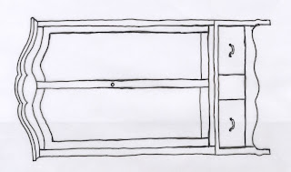
From my original drawings I created vectors of a wardrobe that would be the opening of my app. I experimented with different ways of colouring in this line drawing but decided upon a full fill colour as it fits the digital aesthetic alot better than the free textured example. I also drew some coat hangers for the inside wardrobe of which you would  view your digital clothes from. 


The name of my app will simply be dress me, this implies that you want someone else to help although it can mean that you will do it yourself, i think it gives an open minded approach to the app. I have chosen Futura as my font of choice as it is fun and playful like the app but is easy to read and universally known.  

The colour scheme I have chosen is bright and colourful fitting the target market of teenage girls. it has a 90s aesthetic like the film clueless which i based the idea of my app on.


APP RESEARCH

COMPETTITOR APPS

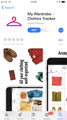
MY  WARDROBE- CLOTHES TRACKER

- Same idea as mine with the keeping all of your clothes in one place. 
- You can log all of your clothes by taking pictures and then they are saved in different categories. 
- You can save looks for each day on the calendar, with a calendar section showing all of the days and what outfits you have picked for that day. 
- You can compile a suitcase for when you go away and need to pack clothes. 
- You can choose from different looks such as casual, classic, glamourous 


 STYLEBOOK 

-uses my idea of helping you choose outfits and looks at current fashions
-allows you to choose looks and look at fashions for inspirations 
- The app links online shopping so you can buy looks 
- The app incorporated vector imagery giving the app a strong individual aesthetic. 


PUREPLE OUTFIT PLANNER

-gives you outfit suggestions 
-option to have outfits picked for you using a random generator.
-this app has a community section so you can connect with your friends.
- the app has quite a refined aesthetic with subtle hints of bright colour.


Wednesday, 15 November 2017

COMPETTOR TITLES

Compettors of my book 

20th Century Travel by Taschen

Lonely Planet's guide to travel photography


The National Parks- An American Legacy