Tuesday, 7 May 2019

INITIAL IDEAS

After reading the book I came up with a few quick sketches of different covers. I want the cover to be not too specific as it needs to represent the whole book. 

Ideas include:
-Pictogram of parliament, showing the Establishment without personifying it. 
-A person with a shadow showing the things they are hiding. 
-A face of the people accused in the book, ie. Rupert Murdock, Gordon Brown, Tony Blaire, Margret Thatcher. 
-A picture of Money 
-Rich taking from the poor, robin hood style cover. 
- A politician in a criminals outfit/handcuffs
-newspaper

I roughly illustrated my ideas out in illustrator in order to get an a feel of what each idea could look like. 
Some feedback on my initial ideas

-I was told I should head away from the criminal ideas as its quite obvious
-the money idea could have a nice aesthetic for the book
-the newspaper idea could be played out further, use of newspaper illustrations

INITIAL IDEAS

- Reusable container that is bought and can then be used many times over

- Milkman Model, stainless steel or glass container to be collected by the company

- Cardboard, easily recycled or composted packaging- no plastic- not very durable

- minimalism

- educating people to not use ready meals


Speaking in crit i presented my ideas so far and tried to discuss where i could take this idea. In order for the ready meal packaging to be sustainable, we discussed that the idea that convenience needs to be scrapped altogether. Plastic is not always recycled by the consumer and in order to make the product sustainable it needs to in some way educate people how to stop buying the ready meals and make their own food. 

The packaging could contain a recipe to make the meal from scratch at home. In the crit we discussed that this could be incorporated into the design of the packaging so that the recipe could be torn off and kept along with others to make up a recipe book of your own. It could be a collectors thing. 

Having a container that could be reused after could tie in with the recipe idea. Once you have eaten the ready meal you can then make it yourself following the recipe and serve it in the reusable container. 

END OF YEAR SHOW BRANDING

I am collaborating on this brief with Migle, Kat and Ali for the end of year show branding. Today we met up in order to discuss ideas for the theme of the branding. We looked at previous years shows in order to get inspiration and an idea of what worked well. 


Initial Ideas 

Using colour
example of work from each course
Circles for each course
Something to reflect each course
Halftone
Jigsaw Puzzle idea each course fitting together 
Going up
Space theme
Universe-ity
Ey up
Big bang
Solar system 
One small step... one giant leap...for graphic design

We decided as a group that we want to explore the idea of space and the quote 'one small step, one giant leap for mankind.' We are going to go off on or separate ways and create some visuals that we think would work following this brief. 


FEEDBACK

I sent my developments to Abby, who said that she thinks the new designs are a bit too over-complicated. she really liked the first designs I did and said instead we should focus on this one. 

Monday, 6 May 2019

BOOK MOCKUPS


The final piece was successful in my opinion. It was very unfortunate that I lost all of the development work for the brief. Although it hindered the overall project it motivated me to push the design and create an outcome that I was more happy with. The final book cover fits the brief well and work well on a bookshelf. With more time I would like to add detail to the towering building as the current one is not that obviously a building and could be more clear. Although, this is in some ways good as it leaves an element of mystery for the reader. I really like how the design has a clear hierarchy of information. Annoyingly I missed the submission date for this design although I did manage to enter my previous design featuring the Penrose stairs, but it was not shortlisted. 

DEVELOPMENT

I tried out a few ideas for a colour-scheme in order to get a feel for what would work in the cover. 


I decided on the theme of a tall towering building. I chose this because it had the potential to be a very impactful cover and I wanted the image to be very striking. I also thought this option was alot more nice than other symbols of the establishment. From here I started playing around with inputting it into the book cover layout. From my initial ideas I preferred the layouts that were more classic rather than something very typographical. The text all needed to be portrait way up to make it easily visible. 

I tried out different colour schemes but I decided that black, red and white worked best for the cover as it was very impactful but also holds a symbolism as it the red signifies danger. It is quite imposing. The red is a warning. Patriotic colours black is a symbol of the establishment the door of downing street. Red sky, dystopian future where things go wrong. 

Trying out different typefaces really changed the impact of the design. I chose a serif font as it reminded me of news type and I wanted to portray the media as this is a big part of the book.


INITAL IDEAS


started playing around with layout of the cover design in order to see how I could place the information. I like typography and wanted this to be a big part of the design. 
My original design focussed around the Penrose stairs. To signify that the rich stay rich and the poor stay poor. I decided not to pursue this when I remade the cover as visually it did not work. 


I sketched out an idea to signify hieght and power 

FINAL PDF FOR PENGUIN

This is the final PDF that I would send to penguin if the contest was still open. I am much more happy with this one than the original one that I sent off in march. The final piece was successful in my opinion. It was very unfortunate that I lost all of the development work for the brief. Although it hindered the overall project, it motivated me to push the design and create an outcome that I was more happy with. The final book cover fits the brief well and work well on a bookshelf. With more time I would like to add detail to the towering building as the current one is not that obviously a building and could be more clear. Although, this is in some ways good as it leaves an element of mystery for the reader. I really like how the design has a clear hierarchy of information. Annoyingly I missed the submission date for this design although I did manage to enter my previous design featuring the Penrose stairs, but it was not shortlisted. 


BOOK COVER CONTENT


The penguin book cover need to be the relevant size and hold the mandatoryinformation. 

Saturday, 4 May 2019

PRODUCTION


DEVELOPMENTS


INITIAL POSTER DESIGNS


INITIAL IDEAS


RESEARCH

A rave is an organised dance party at a nightcluboutdoor festivalwarehouse, or other private property typically featuring performances by DJs, playing a seamless flow of electronic dance music. DJs at rave events play electronic dance music on vinyl, CDs and digital audio. 
Raves became popular in the 1980's with the birth of the music genre Acid House. 

80s and 90s rave culture is inspired by psychedelia as well as the rise in popularity recreational drugs such as ecstasy. Rave is symbolically linked to the smiley face, associating with gurning faces and the release of serotonin in the brain making people feel a sense of happiness. The symbol was first used by Danny Rampling in a club flyer for his club Shoom. People in this scene also followed a distinct unique style, oversized t-shirts, neon colours, sports clothing, shell suits. People took part in free and illegal raves in order to fight authority and get away from their problems. The culture started out originally free raves but with the rise of super clubs in places like Ibiza raving culture became popular and still is around today. The movement relied heavily on strong graphic design in their posters to advertise events. The design paved a new type of music culture which was less about physical album copies but hearing a song once and not knowing its name.


Acid House
In the mid to late 1980s, a wave of psychedelic and other electronic dance music, most notably acid house music, emerged from acid house music parties in the mid-to-late 1980s in the Chicago area in the United States. After Chicago acid house artists began experiencing overseas success, acid house quickly spread and caught on in the United Kingdom within clubs, warehouses and free-parties, first in Manchester in the mid-1980s and then later in London. In the late 1980s, the word "rave" was adopted to describe the subculture that grew out of the acid house movement. Activities were related to the party atmosphere of Ibiza, a Mediterranean island in Spain, frequented by British, Italian, Greek, Irish and German youth on vacation, who would hold raves and dance parties.


Vinyl
In recent years the vinyl has had a renaissance and has become popular again,  2017 was the highest year for vinyl sales since 1991 according to Lilly Puckett from the Fader. this has brought back the concept of an album as an object and making buying music a more valuable experience again. ‘although vinyl lost its status as Britain’s leading albums format as long ago as 1985 and thus looked set for a permanent decline, sales of vinyl LPs rose year on year by 43.7 per cent in 2011.’(Richard Osbourne, Vinyl: a history of the analogue record )  Vinyl has gone from produced for the massed to a luxury item in recent years. This can be put down to the fact that music has become very easily available thanks to streaming online, but buying a vinyl is a physical thing that requires effort to play, not just pressing a button. To physically hold an album has become a luxury. People buy a vinyl of an artist they think is really special as they are expensive to buy and require effort to play. 

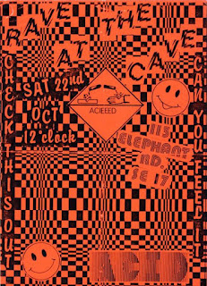
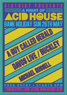
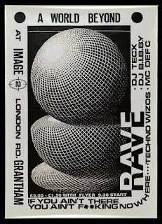
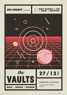
With all good subcultures come a strong artistic culture and so along with the music was artwork. I found my a collection of rave posters and interesting designs on the the internet and instagram in order to get some inspiration for the Mangoes and Melons poster.